©2025 JEMA.
All rights reserved.
www.jema.ai
The Brand
In this section, we delve into the essence of our brand, the values and principles that define who we are and how we present Jema to the world. Discover the audience we connect with, the position we hold in the market, and the personality that sets us apart.
Brand Guidelines Overview
Our brand guidelines are designed to ensure consistency and coherence in our branding efforts across all channels and touchpoints. By following these guidelines, our team can maintain the integrity of our brand identity and effectively communicate our values and personality to our audience.
These guidelines cover everything from our logo usage and color palette to our tone of voice and imagery guidelines. They serve as a comprehensive resource for anyone involved in creating content or representing Jema in any capacity.
Brand Positioning
Imagine having your very own AI-powered career companion, with a deep understanding of your needs. That's Jema. More than your typical AI assistant, Jema is your personalized AI career guide, with the heart of a career counselor. Through her intuitive conversational style, Jema gets to know you to uncover hidden career paths and provide actionable insights empowering you to take control of your career journey.
Whether you're brainstorming new directions, refining your resume, applying for uniquely matched roles, or seeking guidance on your next career move, Jema is always ready to listen, advise, and empower you. Your career journey is unique, and Jema understands that.
Never be alone in career decisions again. Navigate your career with confidence with the truly one-of-a-kind career confidant, tailored to your individual needs, whenever and wherever you need her.
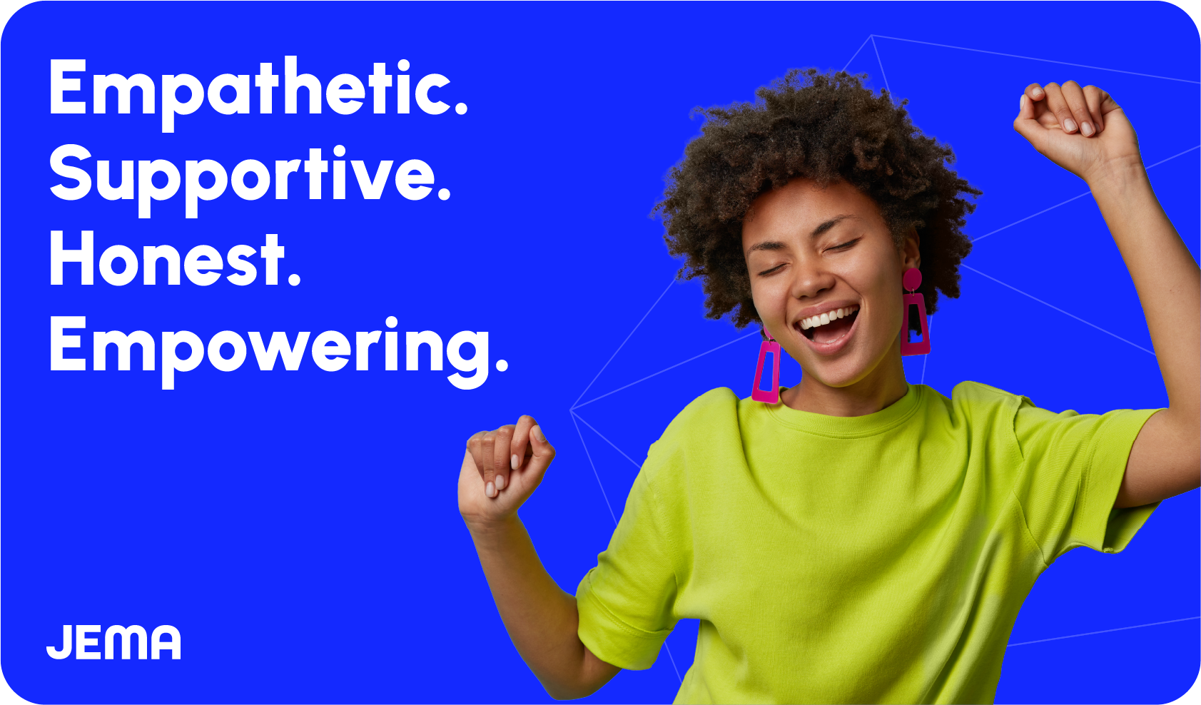
Brand Essence
Jema is not a vibe — she is the voice.
She’s bold, emotionally intelligent, unfiltered, and real.
She doesn’t guess. She gets you.No corporate masks, no stock fluff, no fake "career advice" energy.
Every piece of content should make someone feel seen, held, or called back into their power.
Tone Of Voice
In essence, our messaging tone aims to:
Build trust and rapport with users by demonstrating empathy and understanding.
Inspire confidence and motivation by highlighting JEMA’s empowering capabilities.
Establish credibility by showcasing JEMA’s intelligence and effectiveness.
Create a sense of community, accessibility, understanding, and support by emphasizing the "career companion" concept.
Logo
In this section you'll discover the backstory of our logo's creation, the symbolism embedded in its design, and the guidelines ensuring its consistent and effective usage across platforms.
The logo
The logo contains a sleek and sophisticated wordmark, embodying our commitment to clarity, approachability, and modernism.
Wordmark
Use the prescribed spacing to let our Jem logo breathe. This example demonstrates the J of our wordmark at full scale to define the minimum safety area.
The JEMA wordmark should not be placed next to the JEM logomark.
Logomark
Use the prescribed spacing to let our JEM logomark breathe. This example demonstrates the JEM scaled at 25% to define the minimum safety area. This area must not be imposed upon by other graphics.
Logo Variationns
The logo may be used in several ways and it different color variants. The flexibility of the logo system allows for easy usage and impact across all platforms.
JEMA Wordmark

Primary - Blue

Primary - Light

Secondary - Dark

Secondary - Green
JEMA Logomark

Primary - Blue

Primary - Light

Secondary - Dark

Secondary - Green
Logo Usage: Do's & Don'ts
Here's a few examples of how to apply (or not apply) our branding. Please contact us if you have other usage questions.
JEMA Wordmark
DON'T stretch or alter wordmark in any way

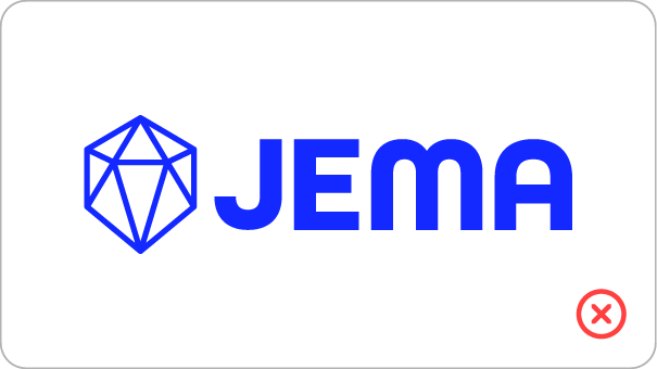
DON'T use the JEM as the primary branding
DON'T crop wordmarks

DON'T use unapproved color variations
DON'T use unapproved fonts
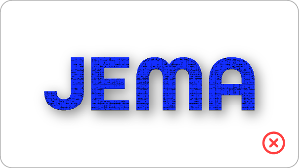
DON'T use any effects or textures
JEM Logomark
DON'T add unapproved colors to the JEM
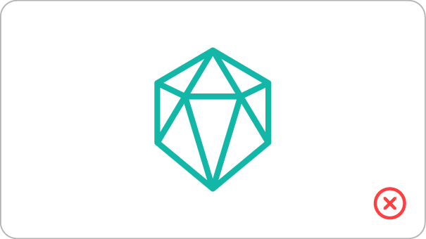
DON'T use the JEM as the primary branding
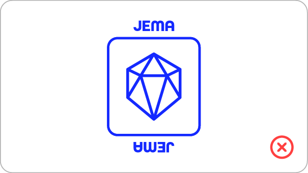
DON'T add any unauthorized elements

DON'T use unapproved color variations
Downloads
Typography
Typography is one of the cornerstones of our visual identity. A good pairing of fonts and a strong hierarchy ensure maximal visual impact. Beneath you will find information about the typefaces we use.
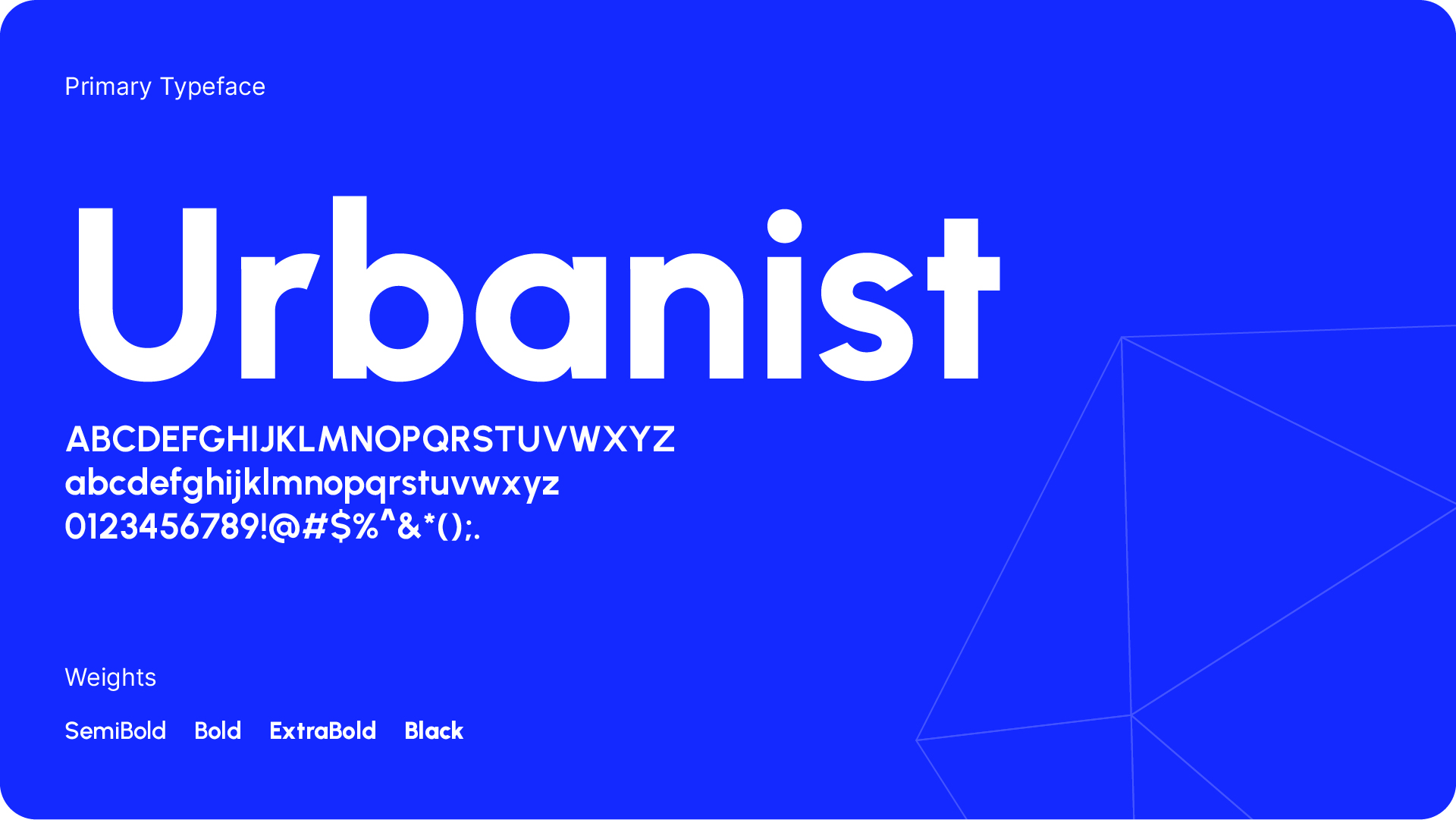
Primary Typeface
Urbanist is a low-contrast, geometric sans-serif inspired by Modernist typography and design. The project was launched by Corey Hu in 2020 with 9 weights and accompanying italics. Conceived from elementary shapes, Urbanist's neutrality makes it a versatile display font for print and digital mediums. It is currently available as a variable font with a weight axis.
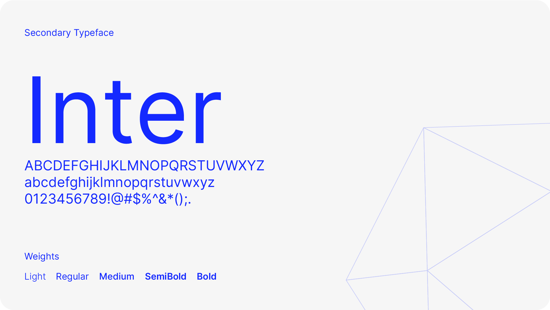
Secondary Typeface
Inter is a typeface carefully crafted & designed for computer screens. Inter features a tall x-height to aid in readability of mixed-case and lower-case text. Inter is used for all paragraphs and body texts as well as subheadings etc.
Colors
The colors are another essential part of of our visual identity across all platforms. In the following section you will find the primary colors as well as an extended palette to be used for web.
Primary Color Palette
The primary color palette consists of two supporting colors and two brand color. These colors are used in our used in our logos and across the brand.
Magenta: 83%
Yellow: 0%
Black: 0%
Magenta: 0%
Yellow: 31%
Black: 0%
Magenta: 100%
Yellow: 0%
Black: 88%
Magenta: 0%
Yellow: 0%
Black: 0%
Extended Color Palette
When designing for the web a more nuanced and extensive color palette is defined to give the freedom to create a more nuanced design while still operating within the boundaries of our visual identity. More accent colors will be added to this section.
Brand Primary
Brand Secondary
Neutrals
Icons
Our icon set is a toolbox for creating supporting graphics and they are based on icons from Angular Icons. The icons are always used in our brand colors and in an outlined version like shown below. All i
Brand Color Version
A brand color version of the icons can be used on light, dark blue, and dark backgrounds.

Dark Version
A dark version of the icons can be used on light backgrounds.

Light Version
A light version of the icons can be used on light, dark blue, and dark backgrounds.

More Icons
Our icon set is limited to the most basic icons at the moment. More icons can be added to specific project if the need occurs. For ensuring consistency all the new icons must be added from the same base icon set Angular Icons and are free to download.
Patterns
Supporting graphic elements and patterns can be used to add details and attract attention. Our pattern comes in different colorways.
Brand Color Pattern
The pattern can be used as a background graphic, an overlay etc.

Dark Blue Pattern
The pattern can be used as a background graphic, an overlay etc.

Light Blue Pattern
The pattern can be used as a background graphic, an overlay etc.

Website
Our website is the main touchpoints for our global clients. The look and feel of our website is in line with the overall identity and offers a great set of services, resources and subpages. Our CMS allows internal editors to easily create new and engaging content.


Applications
In this section you will find examples of how our logo and visual identity can be applied to various formats and objects.


Social Media
In this section you will find examples of how our logo and visual identity can be applied to social media.


Templates
In this section you will find several different templates to download. The templates include proposals, checklists and more.


